The United Nations General Assembly has overwhelmingly backed an initiative calling for greater use of world maps that more accurately represent the true size of continents, in a move that could gradually change how the world is depicted in classrooms, institutions and digital platforms.
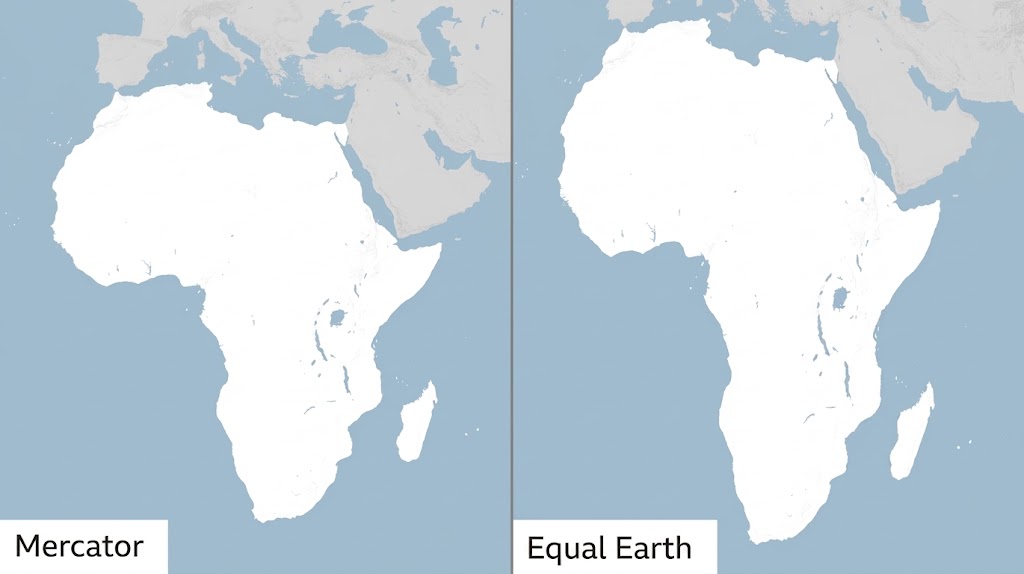
The resolution, spearheaded by Togo and supported by the African Union, promotes alternatives to the centuries-old Mercator projection, including the Equal Earth projection, which gives a more accurate representation of the relative size of land masses.
The vote on Friday saw 164 countries support the resolution, while six abstained and the United States was the only country to vote against it. Although the resolution is not legally binding, its supporters hope it will encourage governments, schools, international organisations and mapping companies to reconsider the projections they use.
Why Africa Looks Smaller on the Familiar World Map
The debate centres on the Mercator projection, developed by Flemish cartographer Gerardus Mercator in 1569.
The map became hugely influential because it was particularly useful for maritime navigation. However, it comes with a major geographical limitation: the farther a region is from the Equator, the more its apparent size is exaggerated.
This means countries and territories in the far north and south appear considerably larger than they actually are, while regions around the Equator appear comparatively smaller.
Africa is one of the clearest examples.
On a conventional Mercator map, Greenland can appear roughly comparable in size to Africa. In reality, Africa is approximately 14 times larger than Greenland.
The distortion can also make Europe, Russia, Canada and other high-latitude regions appear much larger relative to Africa than they really are.
The problem is not that the Mercator map is simply “wrong.” Rather, it is a consequence of trying to represent the curved surface of a three-dimensional planet on a flat sheet of paper or screen. Every world map projection involves some form of compromise between size, shape, distance and direction.
Read Also : Duane “Keffe D” Davis Found Guilty of Orchestrating Tupac Shakur’s Murder 30 Years Later
Enter the Equal Earth Map
The alternative being promoted by the African Union is the Equal Earth projection, developed by cartographers Bojan Šavrič, Bernhard Jenny and Tom Patterson in 2018.
Unlike Mercator, Equal Earth is an equal-area projection. This means that the relative areas of continents and countries are preserved more faithfully, allowing viewers to make more meaningful comparisons of their actual geographical size.
Africa consequently occupies a much more imposing position on the map—not because the continent has become larger, but because the map is no longer shrinking it relative to regions closer to the poles.
The Equal Earth projection was specifically designed to provide a visually appealing world map while maintaining accurate relative areas.
A Map Is More Than Geography
For supporters of the initiative, the issue goes beyond cartography.
Togolese Foreign Minister Robert Dussey, whose country has led the campaign at the United Nations, has argued that maps influence how people understand the world.
Ahead of the UN vote, Dussey told Reuters: “A fair world begins with a fair map.”
Supporters argue that generations of students have grown accustomed to seeing Africa visually diminished on commonly used maps. They believe this can contribute, at least symbolically, to misconceptions about the continent’s geographical scale and importance.
The campaign has therefore become part of a wider conversation about how Africa is represented internationally and whether inherited systems of representation continue to influence perceptions of the continent.
The African Union has previously endorsed the Equal Earth approach, with all 55 of its member states backing efforts to promote maps that better represent the relative sizes of the world’s continents.
The UN Is Not Banning the Mercator Map
Despite the excitement surrounding the vote, the UN decision does not mean the Mercator projection has been outlawed.
The resolution is non-binding and does not require every country, school or technology company to immediately abandon the Mercator projection.
There are also situations where Mercator remains useful. Its preservation of angles and directions made it particularly valuable for navigation, which was one of the reasons it became so influential in the first place.
Instead, the UN resolution encourages wider consideration and adoption of equal-area projections for educational, institutional and other purposes where accurately comparing the size of continents matters.
France Also Moves Away From Mercator
The UN vote comes amid a broader international reconsideration of how the world should be represented on maps.
France announced on Friday that it would move away from Mercator for its official world maps in favour of the Eckert IV projection, another projection designed to provide a more balanced representation of land areas.
The French decision adds momentum to a campaign that supporters hope will eventually influence school textbooks, government publications, media organisations and digital mapping services.
Togo has indicated that it intends to update its own school geography materials and work with international organisations and technology companies on promoting the new approach.
Read Also: A $4 Trillion Hand-Off: John Ternus Takes the Helm as Tim Cook Steps Down at Apple
What Would Africa Look Like on a More Accurate Map?
The change is striking.
Africa would visually dominate the centre of many world maps in a way that reflects its actual geographical scale. The continent is larger than China, the United States, India and most of Europe combined in various comparisons, yet conventional maps can make those relationships difficult to appreciate.
A more accurate equal-area projection makes those comparisons immediately more obvious.
It also changes the visual relationship between Africa and Europe. Europe remains geographically significant, but its apparent size is reduced compared with what viewers accustomed to Mercator may expect.
The same applies to Canada, Russia and Greenland, whose apparent dimensions are substantially affected by their positions at high latitudes.
Why This Matters for Africa
For African governments and campaigners, the significance extends beyond producing a more scientifically accurate classroom map.
Africa is home to more than 1.4 billion people, 54 internationally recognised countries and enormous geographical, ecological and economic diversity.
Yet the continent’s physical scale is often poorly understood outside Africa.
Supporters of the “Correct the Map” campaign believe changing the visual representation of Africa can help challenge outdated assumptions about the continent’s place in the world.
It is ultimately a symbolic change, but symbols can influence how people understand geography, history and international relationships.
A New Map for a Changing World?
The UN vote does not immediately redraw the maps hanging on classroom walls or change the maps displayed on people’s phones.
But it represents an important political endorsement of the argument that the way humanity draws the world can influence how humanity sees the world.
The Mercator projection served an important purpose when it was created more than 450 years ago. But with modern cartography offering alternatives that preserve relative land areas more accurately, supporters of the new initiative believe the time has come for the world to reconsider which map it places before the next generation.
For Africa, the message is particularly powerful: the continent has not suddenly grown larger.
The map is simply beginning to show how large Africa has always been.
Never Miss a Story: Join Our Newsletter